GAIS
Bold branding for cheeky underdog
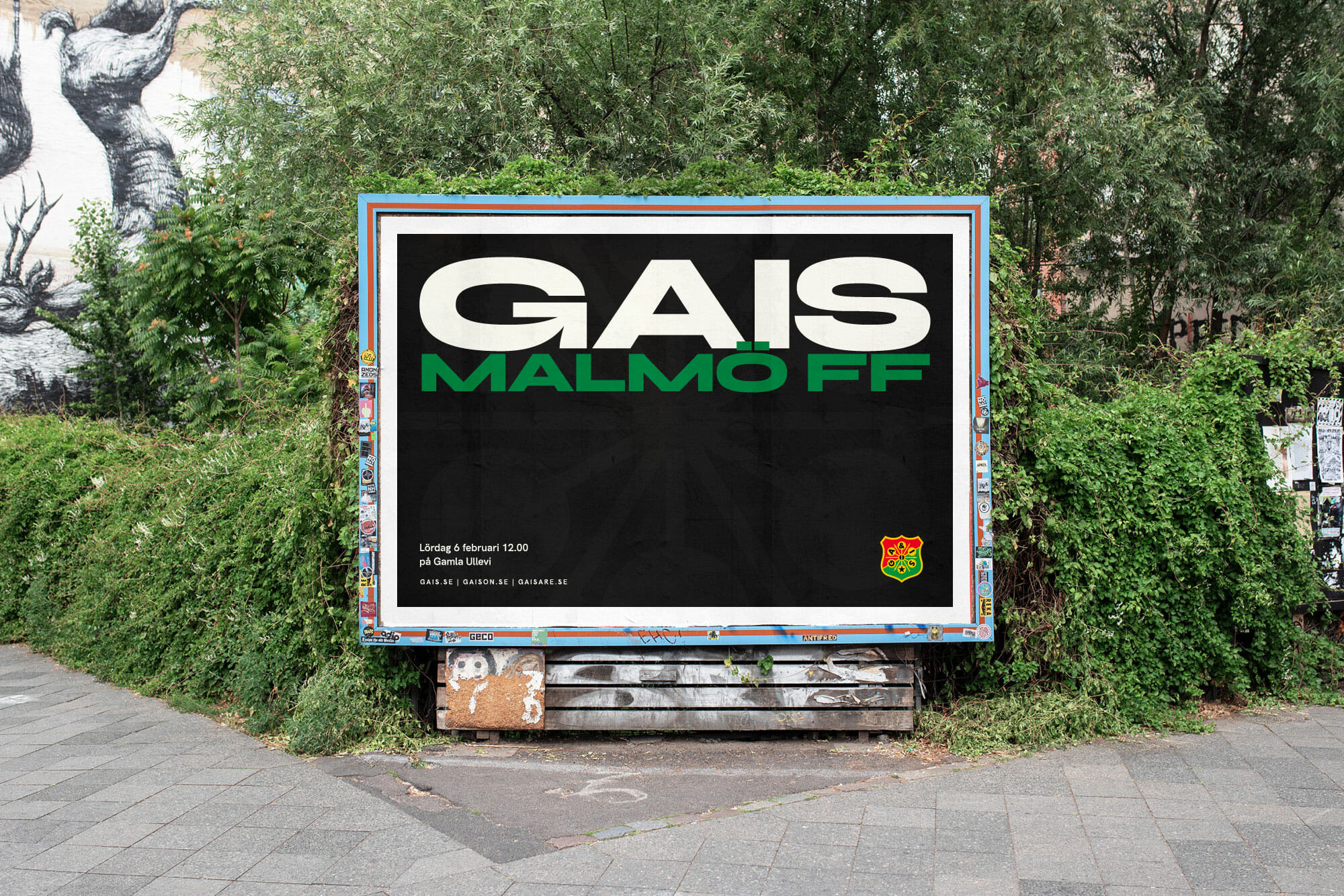
GAIS is an almost 130-year old football club from Gothenburg. They’ve won the Swedish top division four times and are one of the strongest football brands in Sweden.
We did
• Visual Identity
• Communication concepts
• Packaging
• Merchandise
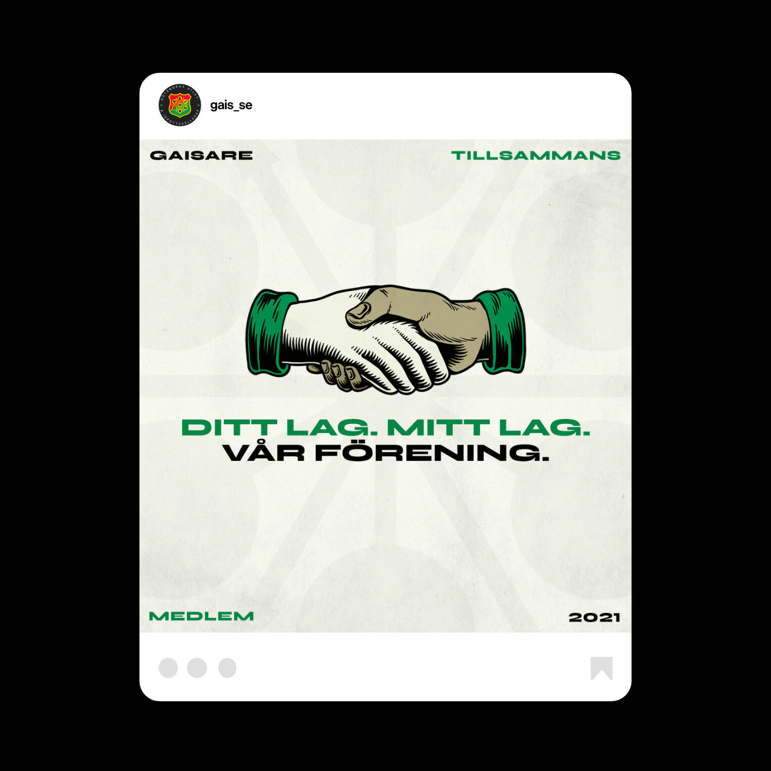
GAIS is a club with a reputation. Often seen as a rowdy underdog that goes against the grain. The supporters have historically been heavily Anglophile and there’s a punk attitude to the club in many senses. GAIS is a club that despite spending a lot of time outside the top tier is both notorious and constantly relevant in Swedish football.
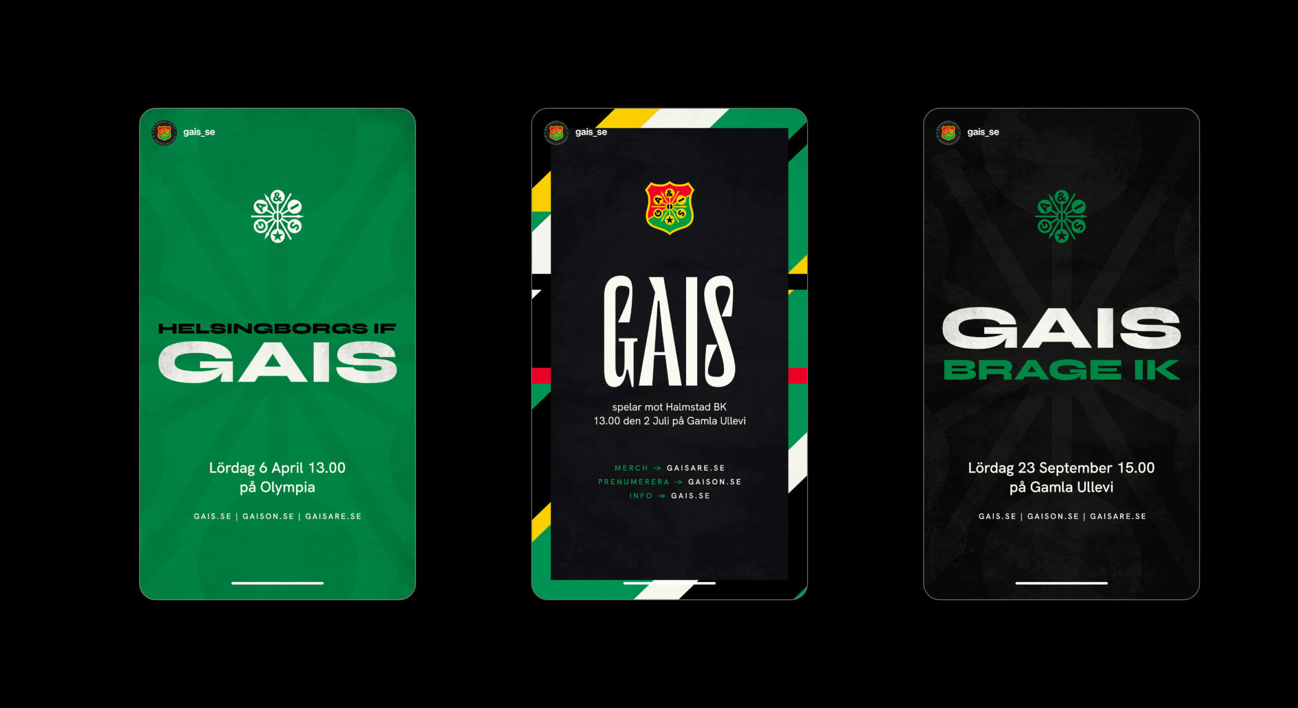
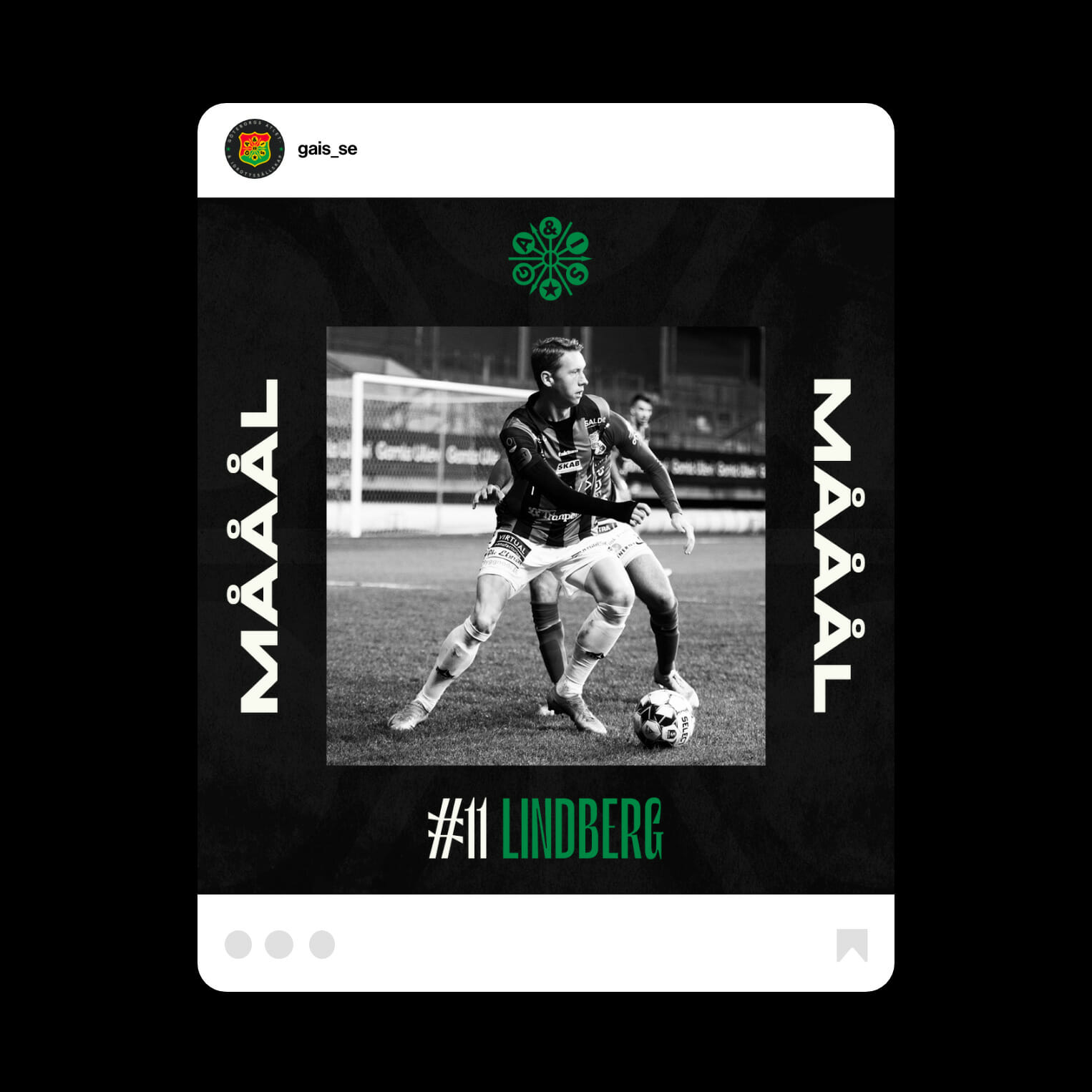
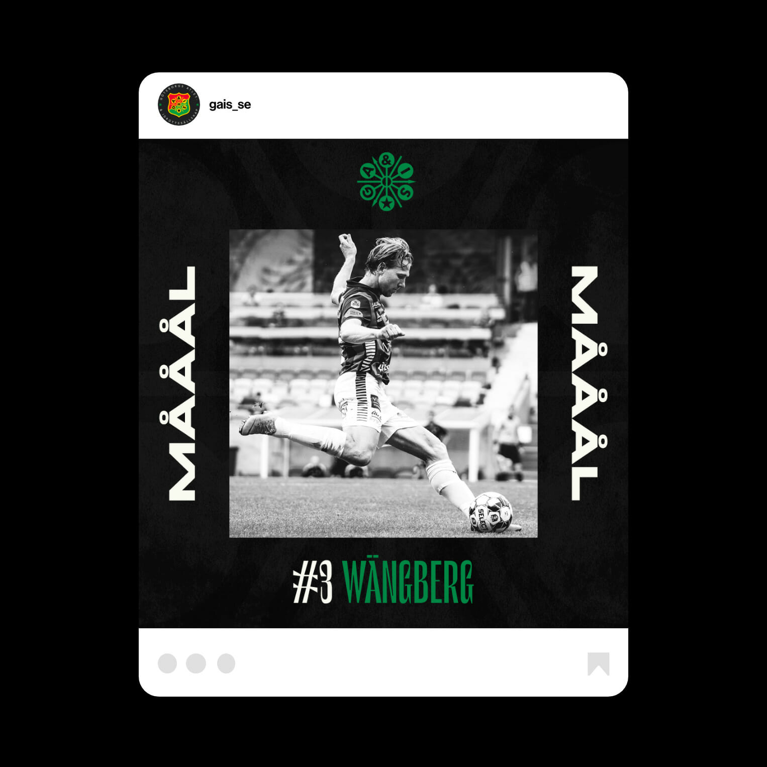
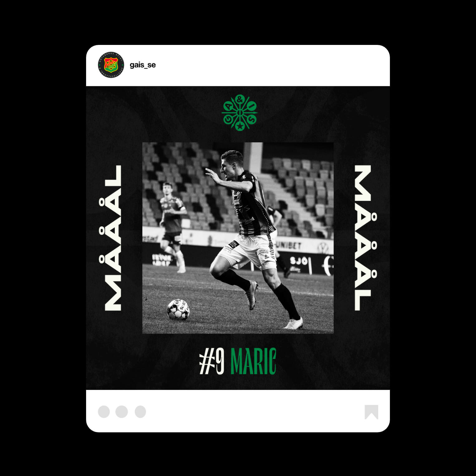
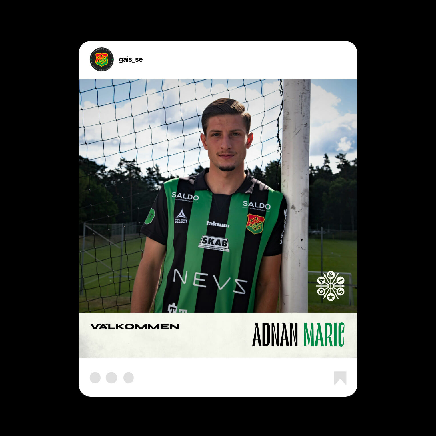
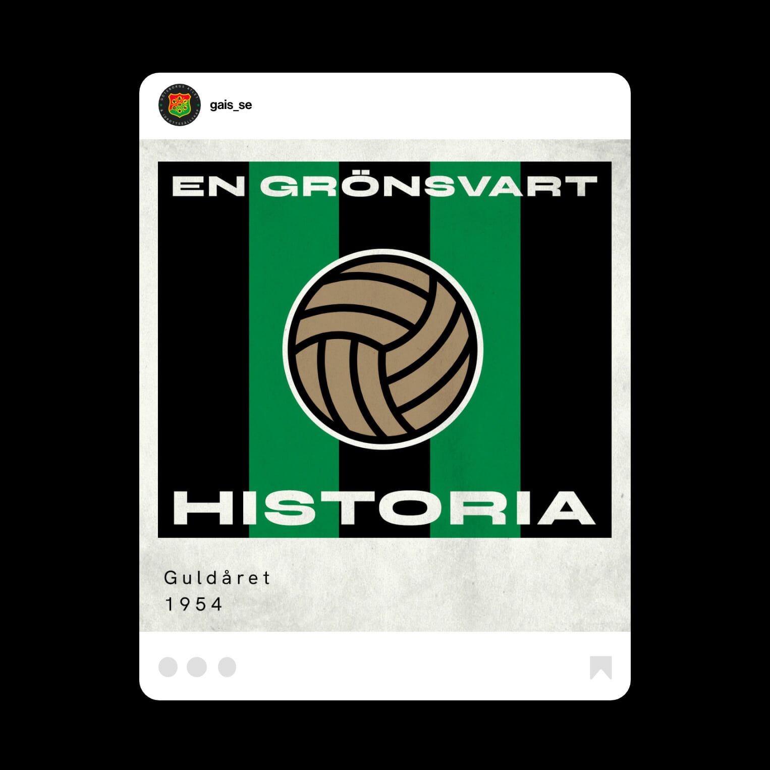
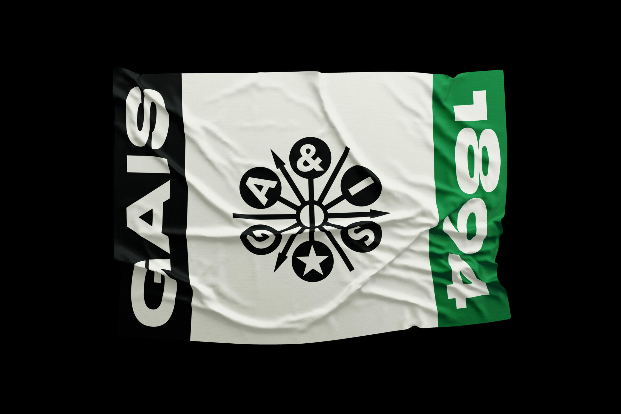
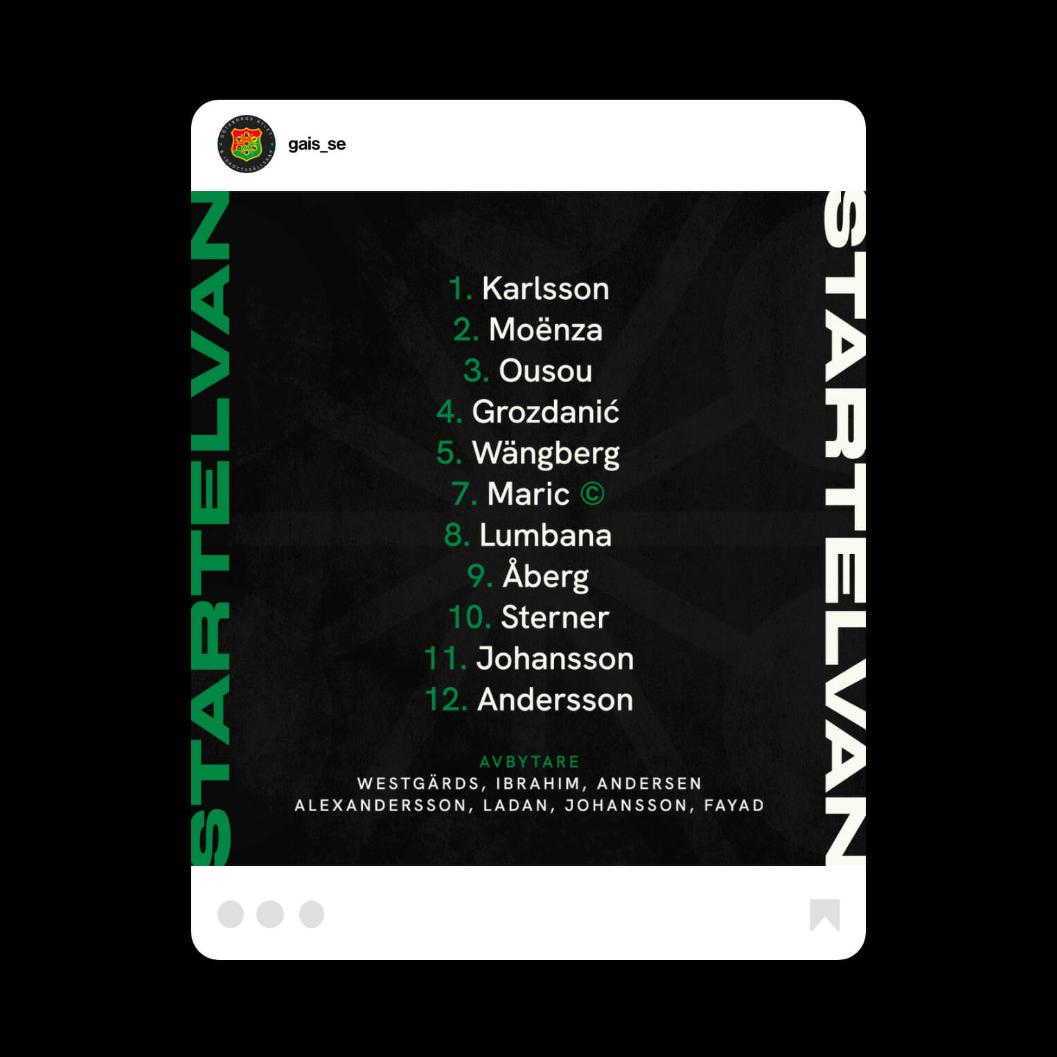
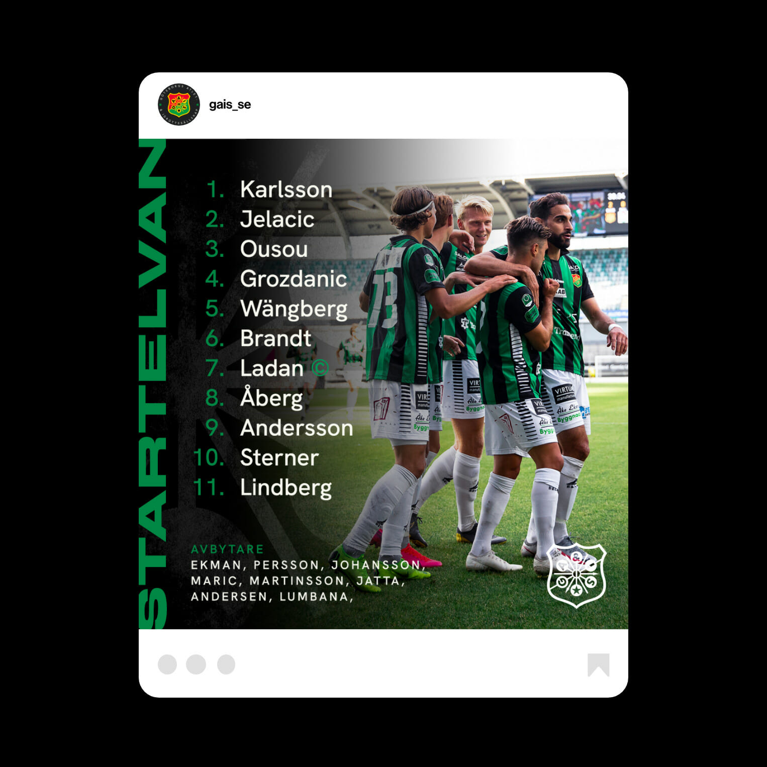
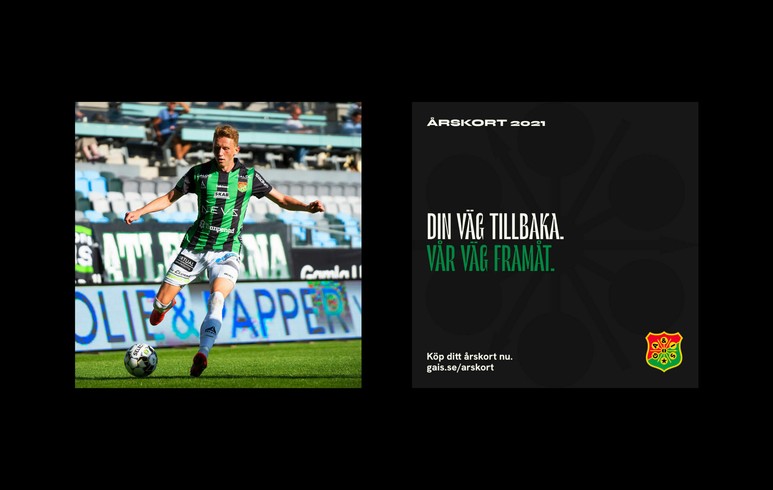
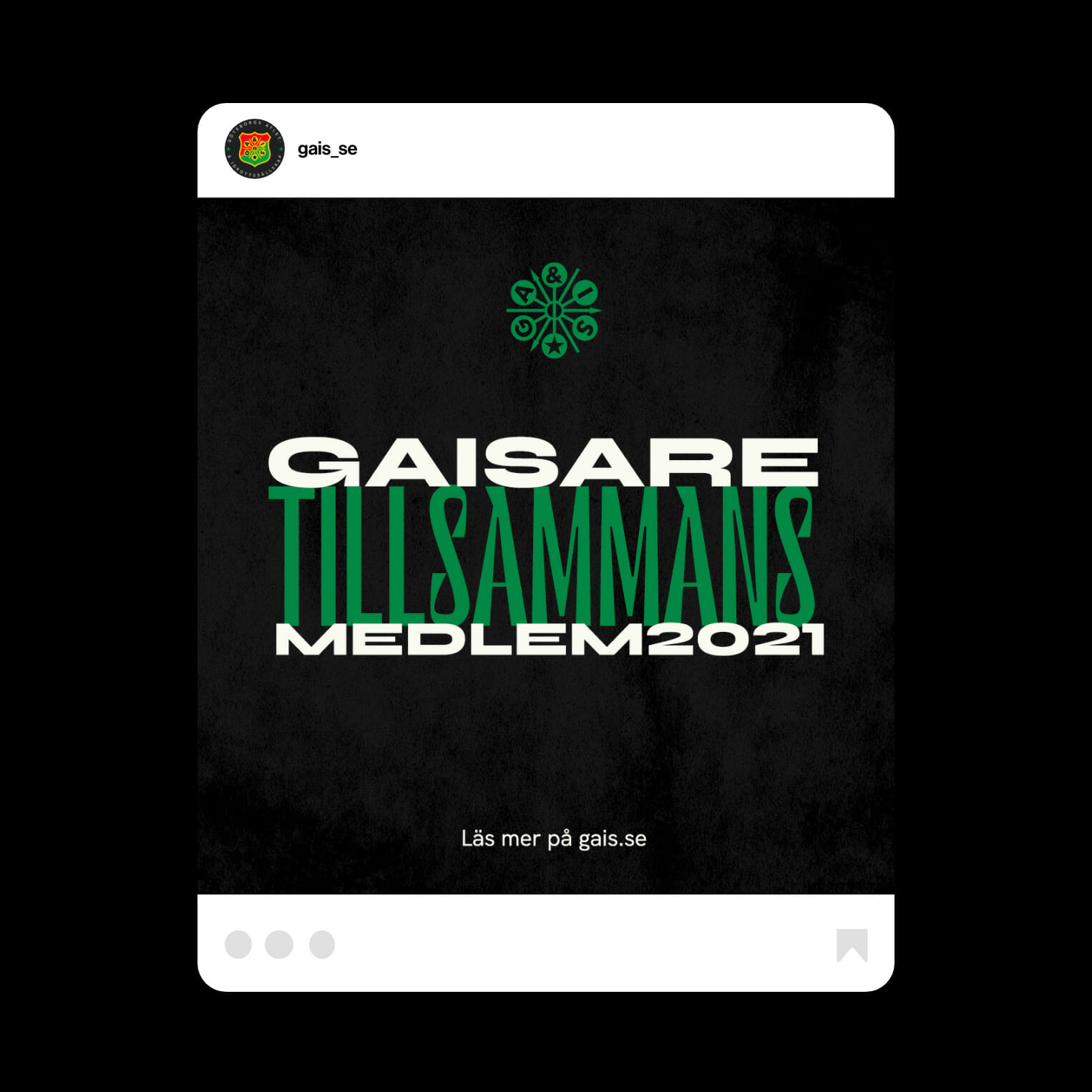
Ahead of the 2021 season Vestkust helped GAIS visualize the image the club already had. Using bold typography, gritty textures and a system of templates the club was able to reaffirm their presence both online in social channels as well as in print through season tickets and advertising.
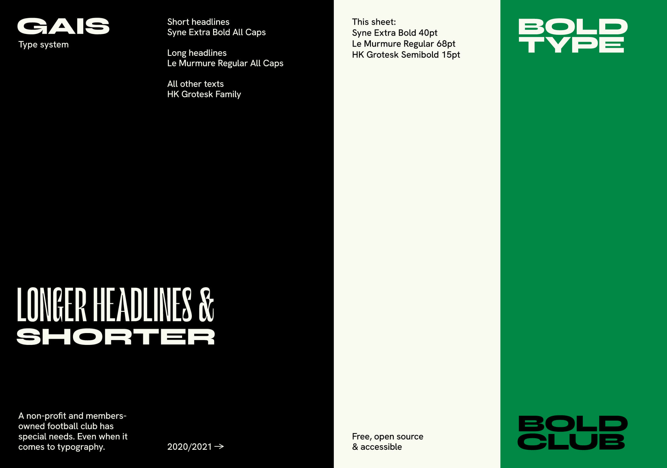
Typography
One of the main points in branding GAIS is that it’s a members-owned and non-profit club. That means keeping costs down is always a main priority. Choosing typefaces was no exception. They had to be free, open source and come with both desktop and web fonts – while at the same time be bold and convey that cheeky tone-of-voice that the club has.
Colours
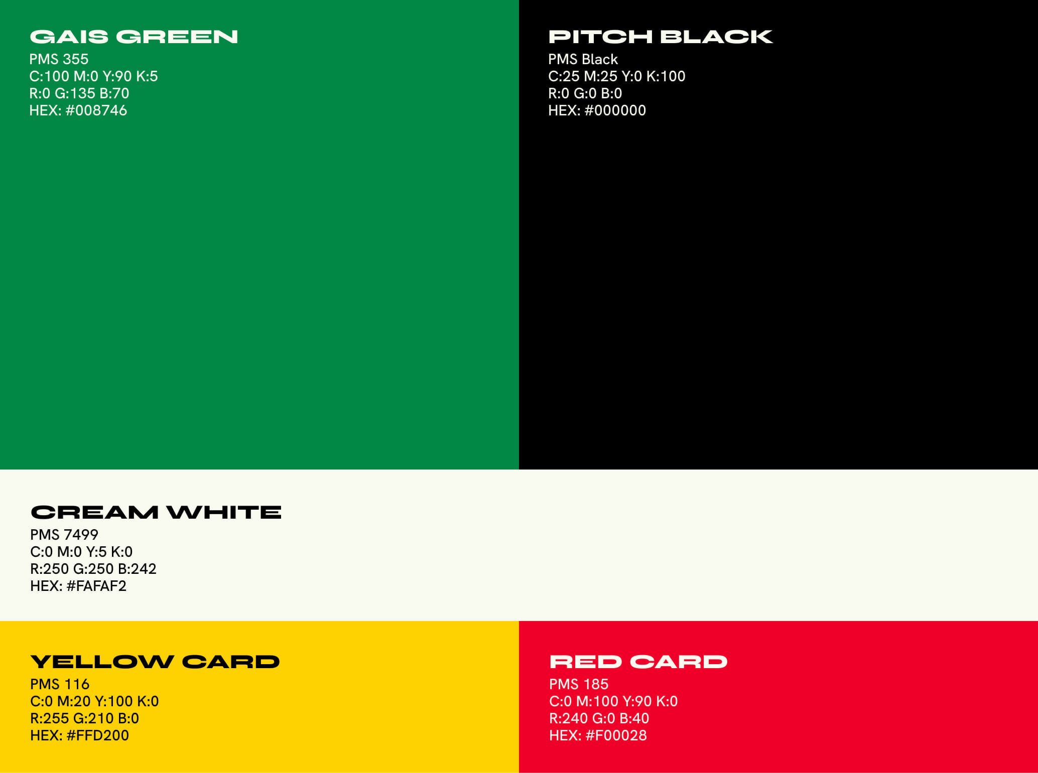
Being one of few teams with black in their kits – as well as being one of very few teams in the world using black and green. The identity utilizes this unique position to the fullest.
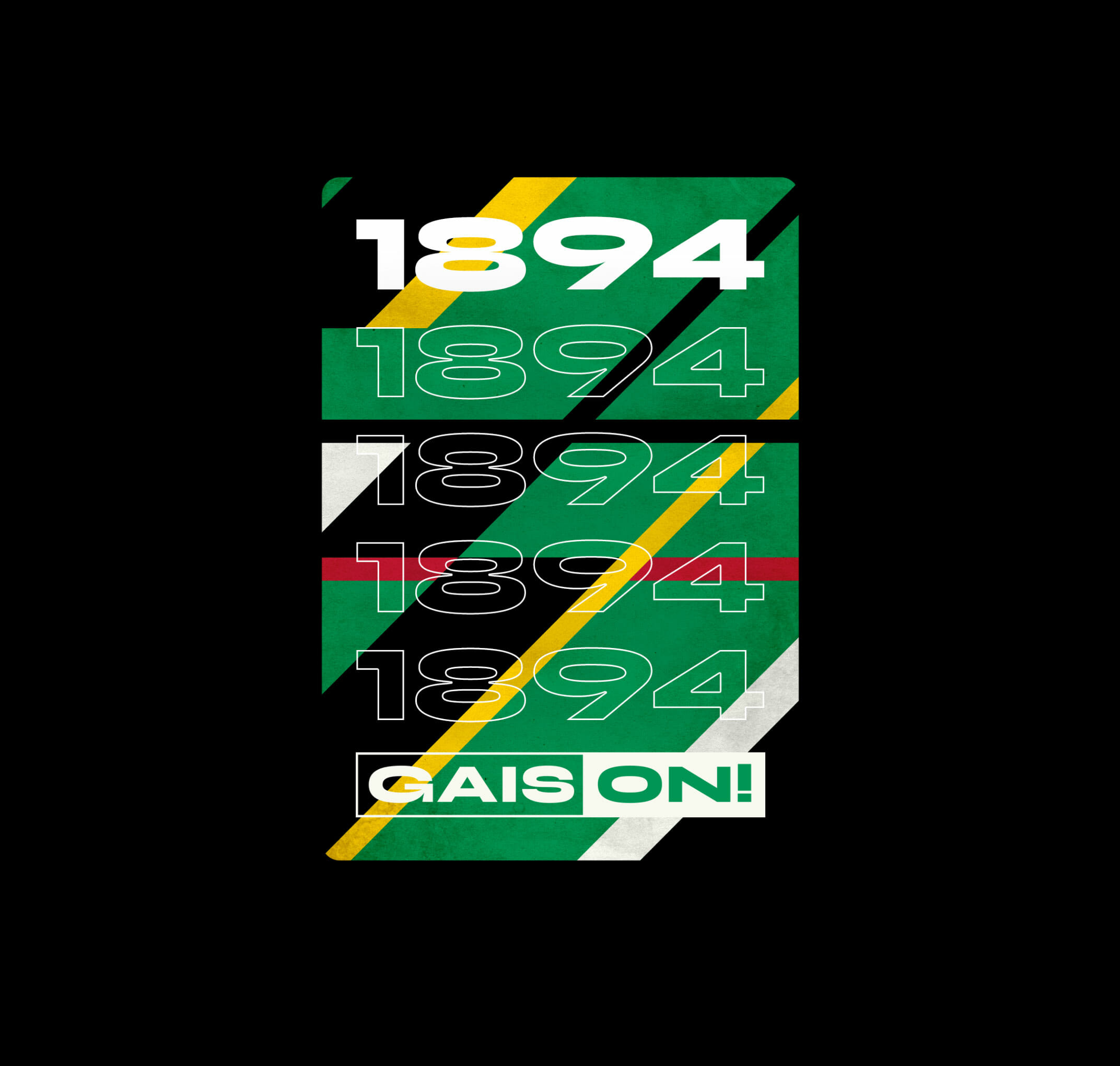
The identity also picks up on the red and yellow from the badge but keeps these colours down to a minimum to not muddle the clubs image as "grönsvart" (the greenblacks).
Subscription packaging
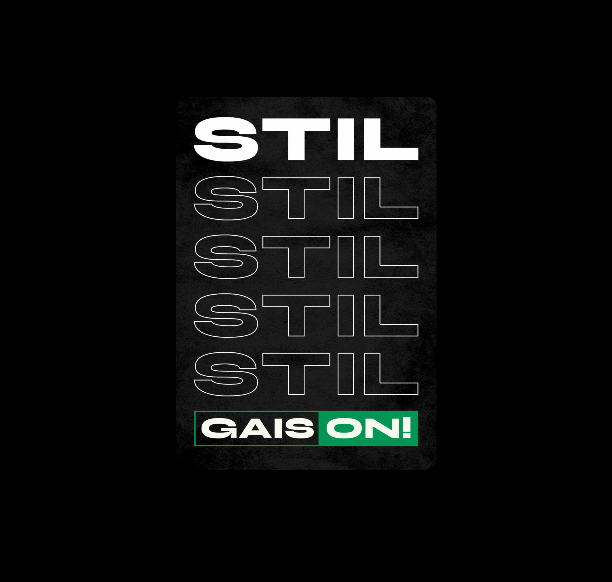
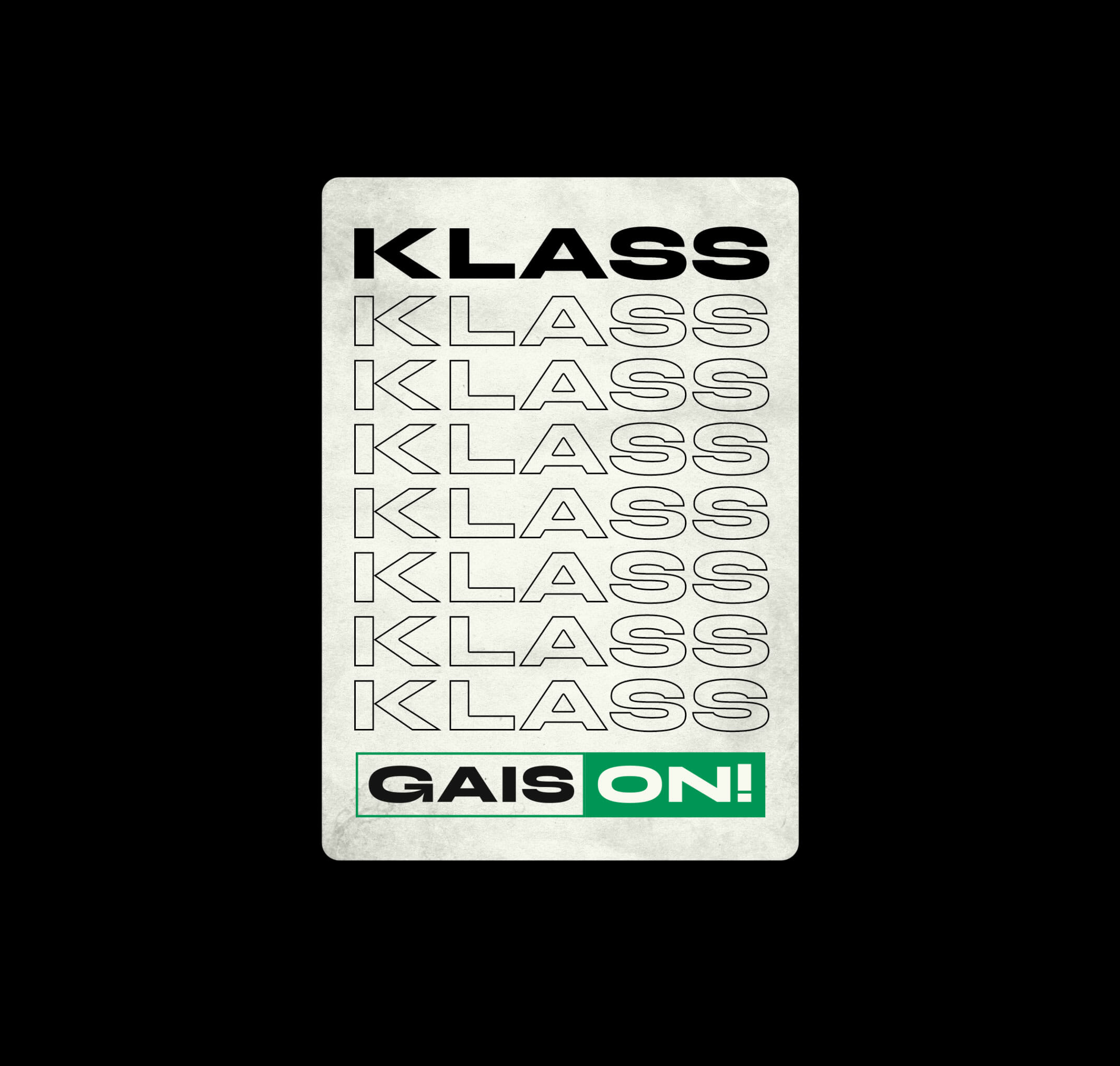
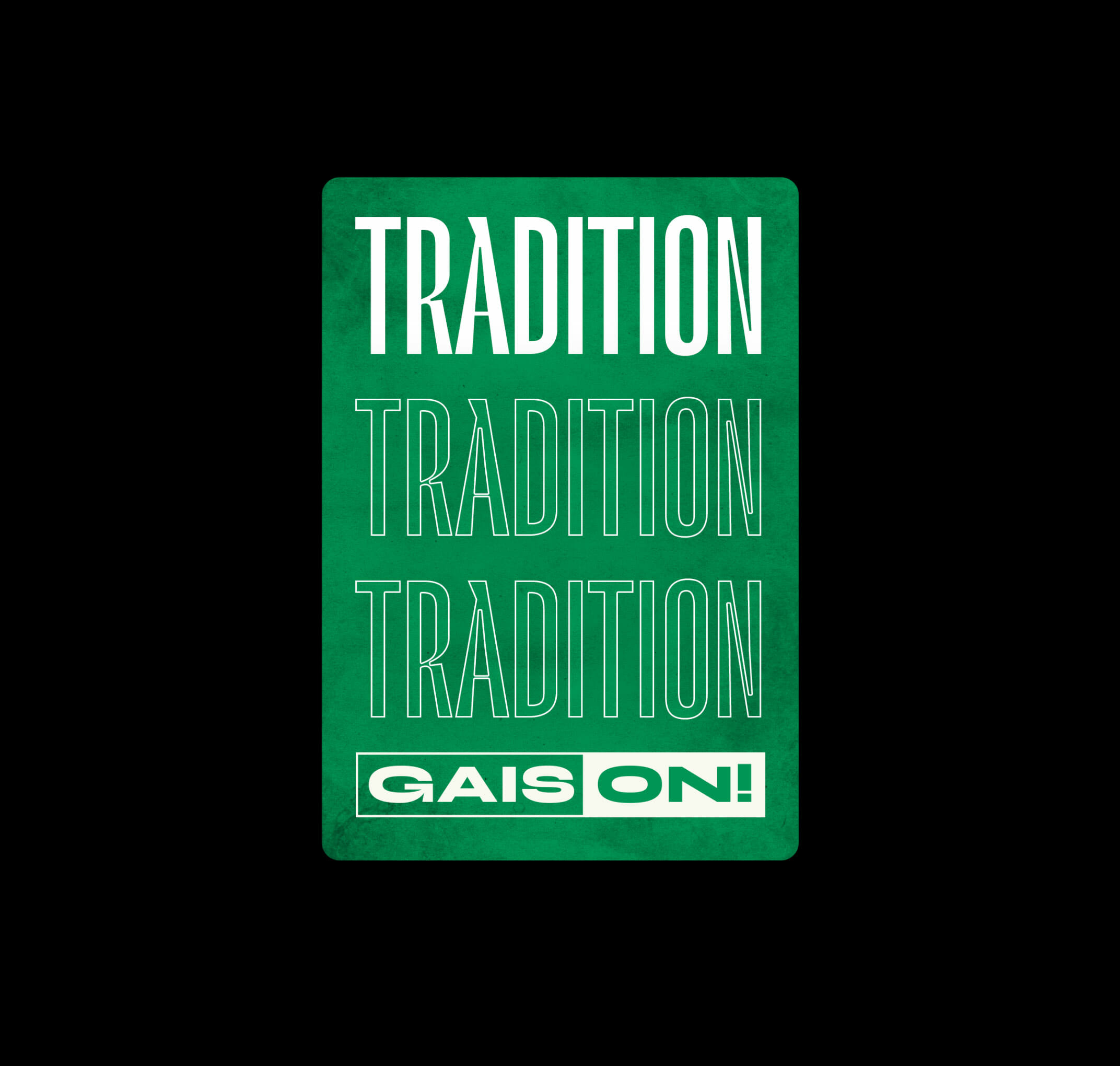
GAIS ON! is concept by the club to get supporters to subscripe to things like jerseys, season tickets and memberships. To give the subscriptions some sense of packaging we created classic "gift cards" for each level of engagement.
Vestkust Ltd
7/9 Admiralty St.
EH6 6JT, Edinburgh
Scotland
United Kingdom
Typeface:
Neue Haas Grotesk
© Vestkust Ltd, 2023